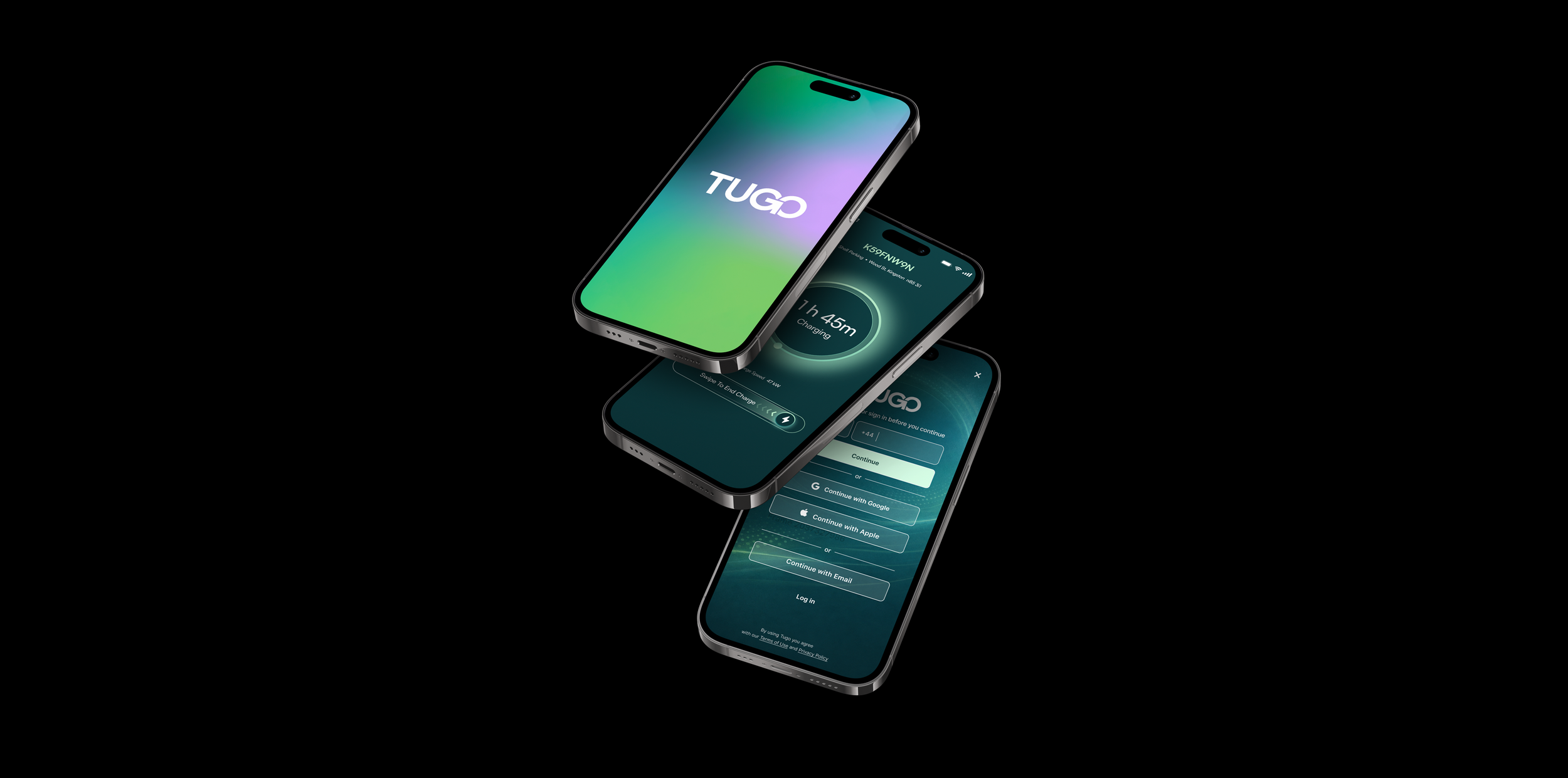
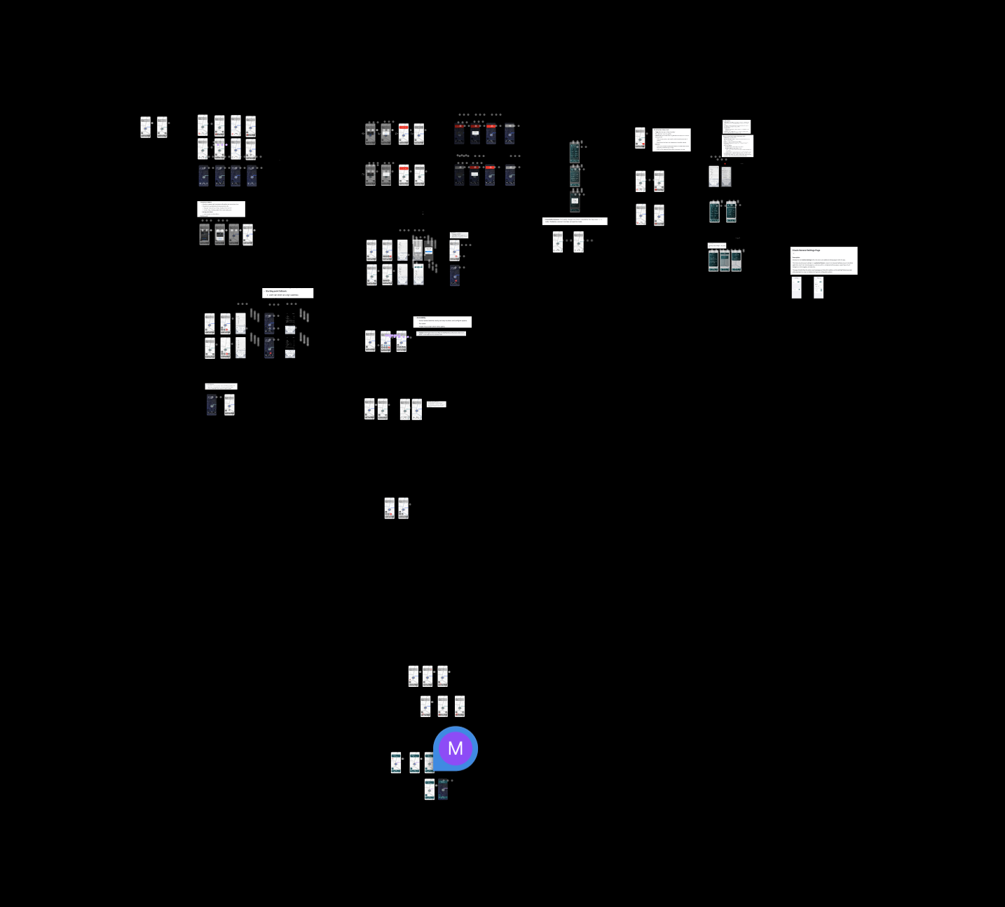
User Experience → dIGITAL tIES, TUGO
CURRENTLY UPDATING
Tasks
Strategy, Growth, Monetisation,
Design system
The Challenge
Time
8+ MONTHS.
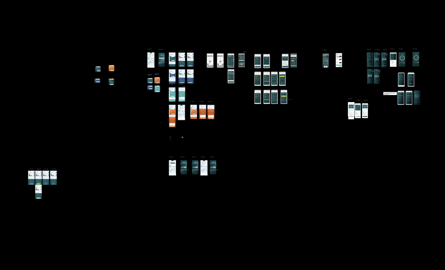
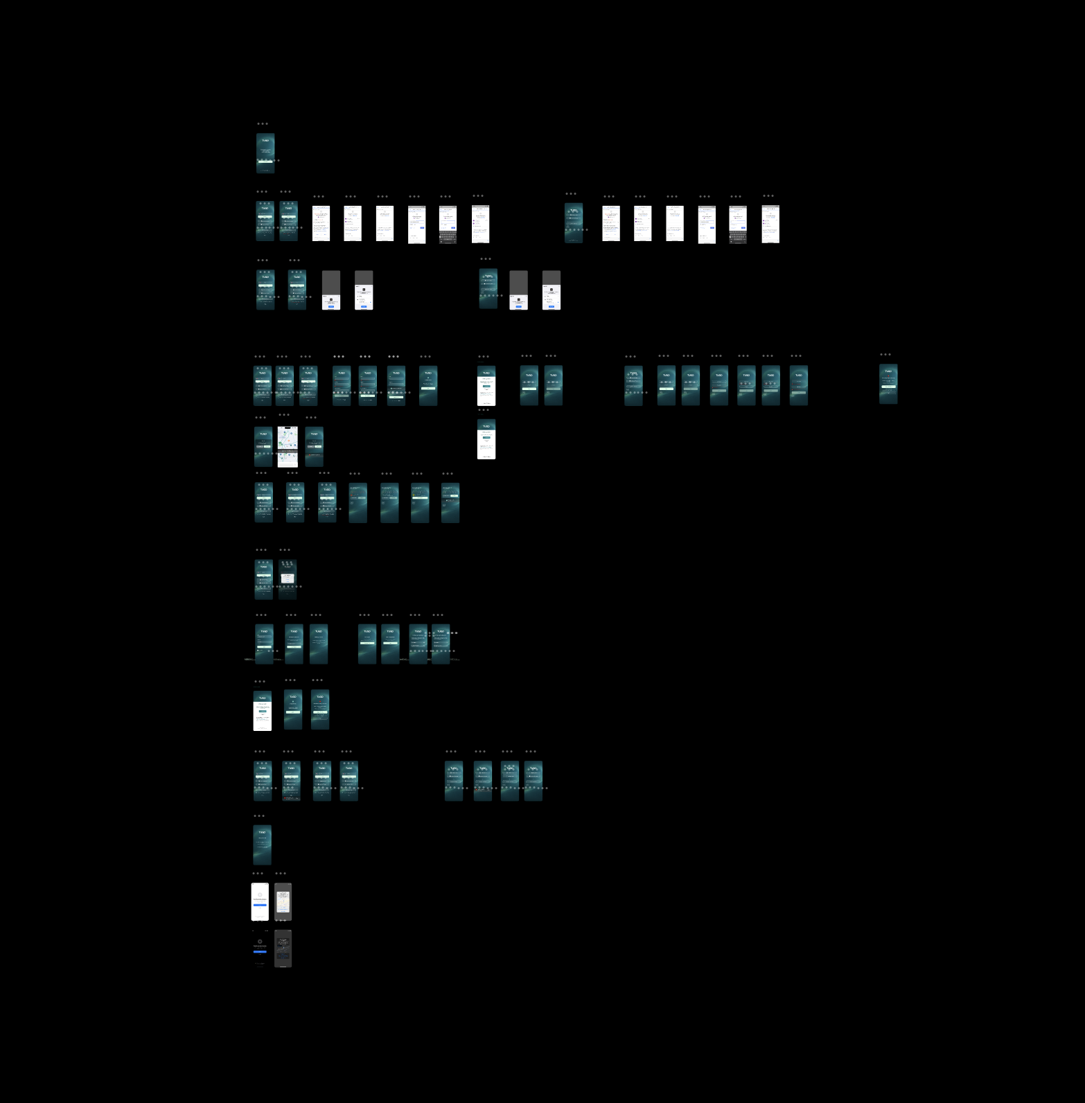
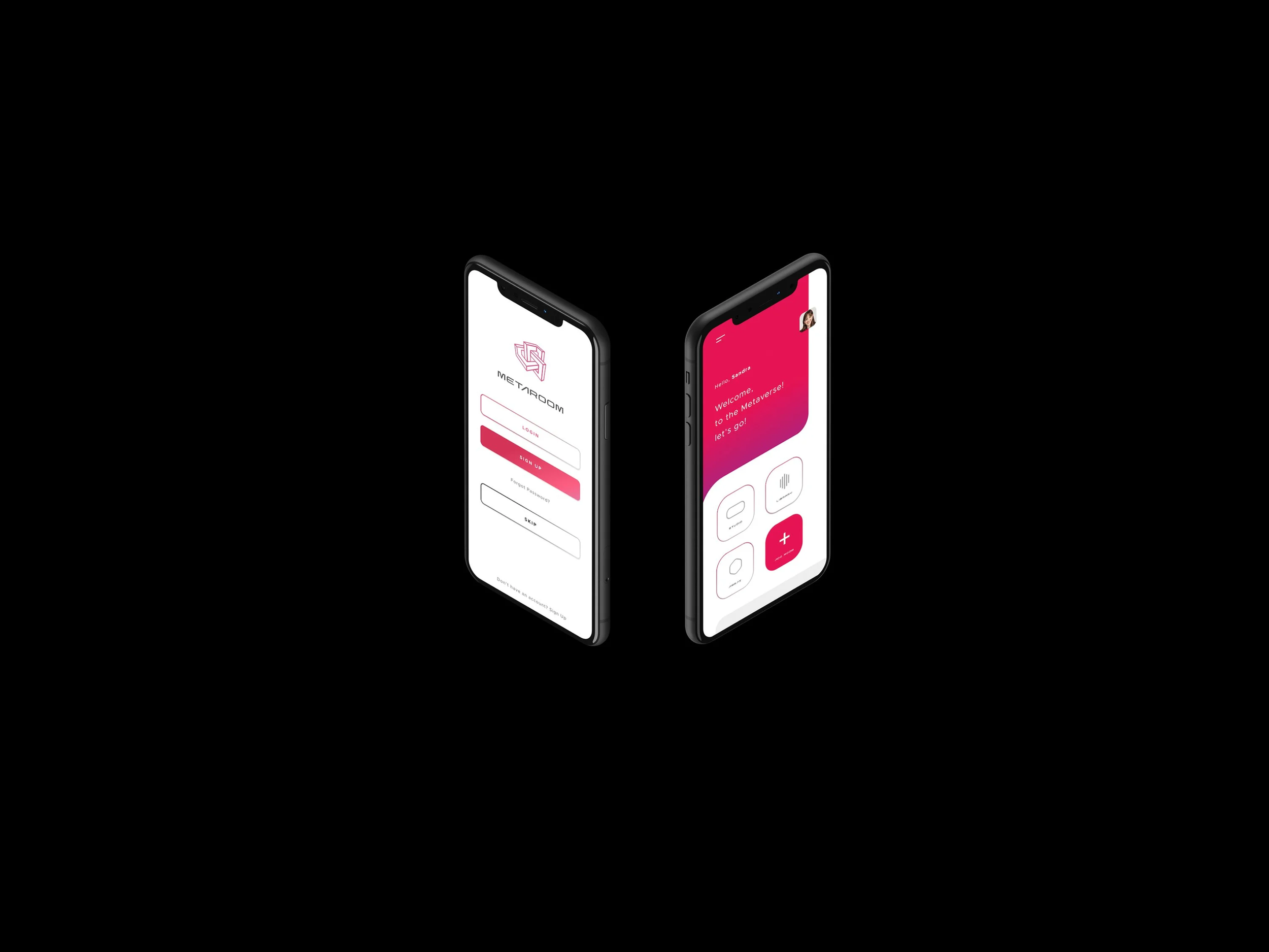
TUGO wasn’t designed to be another parking or charging app. The ambition was to create a connected mobility platform that brings together parking, EV charging, public transport, micromobility, payments, and journey planning through a single, intelligent experience.
While the vision was compelling, the reality was fragmented.
Parking, charging, and mobility services existed in disconnected ecosystems.
Users were forced to switch between multiple apps to complete a single journey.
Trust and confidence were inconsistent across critical decision points.
Complex infrastructure, partner integrations, and operational requirements created friction within the experience.
A scalable design and product framework was needed to support future growth, partnerships, and new mobility services.
The challenge was to transform complexity into simplicity.
To create a platform that makes mobility feel connected, predictable, and effortless while establishing a product ecosystem capable of supporting the future of sustainable transport. This aligns strongly with the TUGO positioning of making mobility “simple, smart and sustainable” through one connected platform.
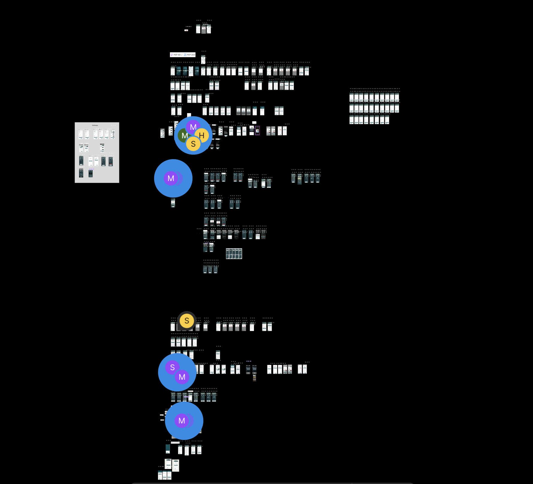
MY ROLE
DESIGN DIRECTOR
Defined the product vision, experience strategy, and design direction for TUGO.
As Design Director, I led the end-to-end vision for the TUGO platform, shaping how product, brand, technology, and business objectives came together to create a unified mobility ecosystem.
Working across leadership, product, engineering, and commercial teams, I established the strategic design direction and experience principles that would underpin the platform’s growth.
Key responsibilities included:
Defined the long-term product vision for a connected mobility ecosystem spanning parking, EV charging, payments, public transport, and micromobility.
Led experience strategy across the entire customer journey, from onboarding and discovery through to booking, charging, payment, and account management.
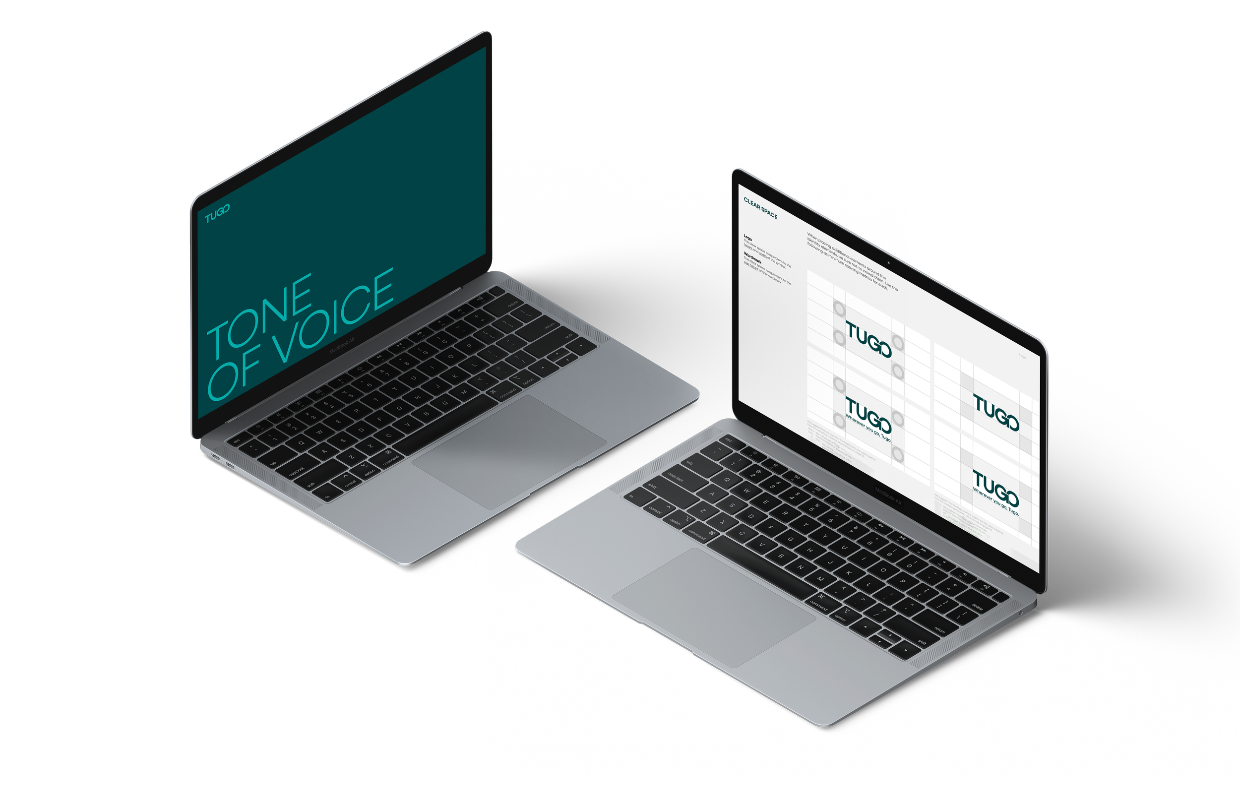
Created the platform design system, interaction framework, and governance model to ensure consistency and scalability.
Directed product innovation initiatives focused on reducing friction and increasing user confidence across complex mobility decisions.
Aligned business, technical, and user requirements into a clear product roadmap.
Established UX audit frameworks and prioritisation models to identify high-impact opportunities.
Shaped TUGO’s visual language, interaction principles, and future-facing digital identity.
Worked closely with engineering teams to ensure design quality and execution across mobile and web products.
Supported commercial growth by designing experiences that increased adoption, engagement, partner value, and transaction opportunities.
IMPACT
Building the foundation for a connected mobility future.
The outcome was more than a redesigned app.
It established the foundations of a scalable mobility platform capable of connecting users, operators, businesses, and public sector organisations through a single digital ecosystem.
By simplifying complex journeys and creating a consistent experience across services, TUGO evolved from a collection of transport functions into a connected platform that helps people move with greater confidence while supporting smarter, more sustainable mobility choices.
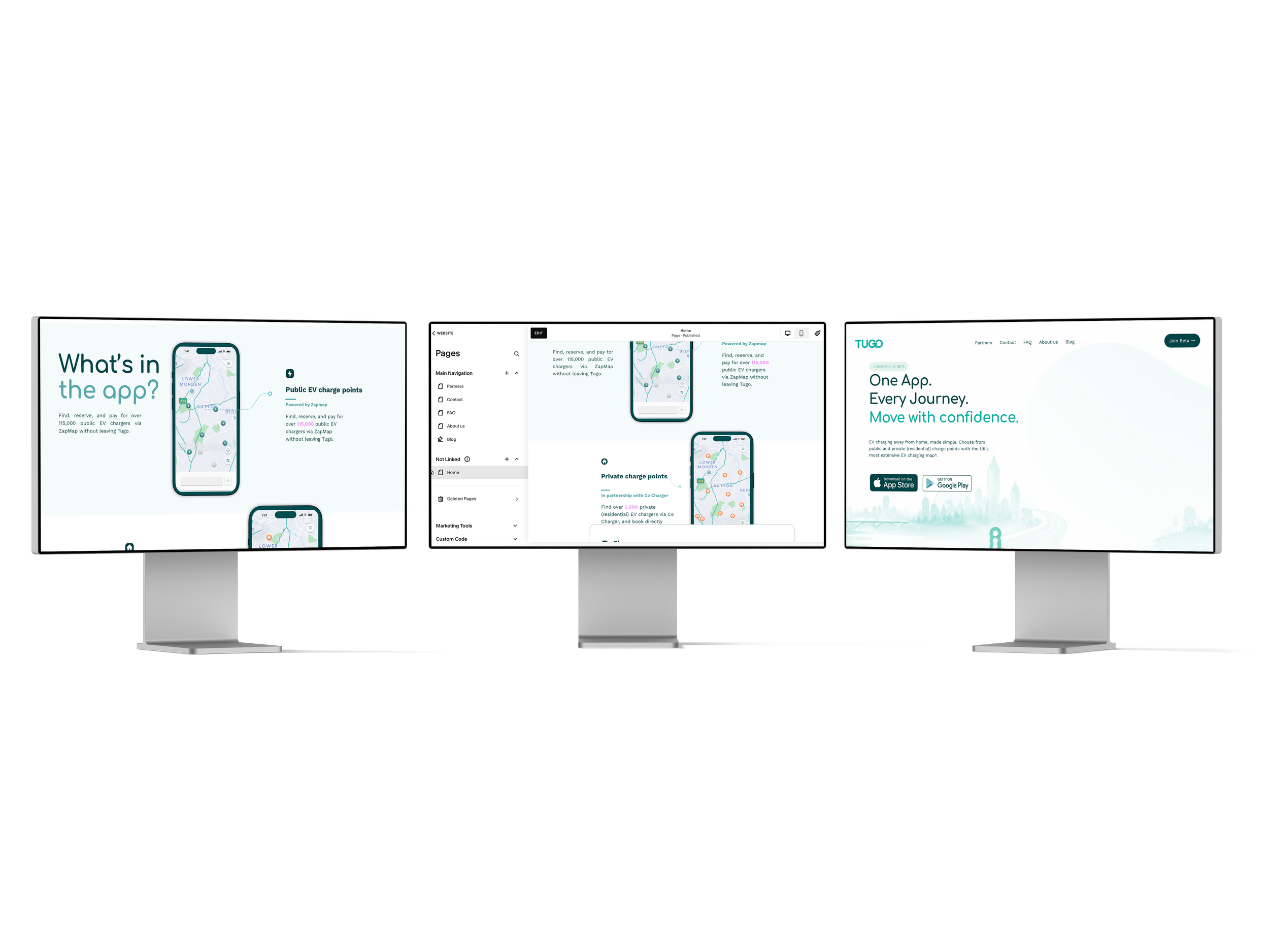
Website Design
Designed and built the Tugo marketing website to communicate the platform’s connected mobility vision through a clear, modern, and scalable digital experience.
Brand & Visual Direction
Translated the Tugo brand into a cohesive web experience using bold typography, motion, colour, and UI systems that reflected simplicity, movement, and connection.
UX & Conversion Design
Structured page flows and content hierarchy to clearly communicate Tugo’s value proposition while improving clarity, engagement, and usability across desktop and mobile.
Responsive Experience
Designed responsive layouts and optimised the mobile experience to ensure consistency, accessibility, and performance across devices.
User Experience → Amrax
Tasks
Strategy, Growth, Monetisation,
Design system
The Challenge
Time
6 Months
Amrax is a spatial planning app that allows users to scan real-world environments and visualize them in 3D. As Director of UX, I was tasked with revamping the product’s user experience to make it more intuitive, cohesive, and scalable. I partnered closely with the Head of Product and a distributed dev team to align the design with business goals while improving usability..
Amrax had powerful 3D scanning tech but struggled to translate it into a seamless user experience. My role was to bridge that gap — transforming fragmented onboarding and inconsistent UI into a cohesive, scalable system
Despite powerful technology, the app’s experience was fragmented:
Onboarding was unclear — new users dropped off early.
UI lacked consistency — from scan page to login, design felt disconnected.
Trust issues — users doubted scan accuracy due to poor visual feedback.
No design system — leading to inefficiencies in development and design.
My Role
Conducted a UX audit across mobile and desktop.
Led user research & testing to uncover pain points.
Redesigned onboarding and scan flows for clarity.
Developed a visual style guide & scalable design system.
Collaborated with developers to ensure seamless implementation
Process
Research & Audit
Interviewed target users to understand needs and frustrations.
Mapped end-to-end journeys to identify drop-off points.
Wireframes & Prototyping
Built low-fidelity wireframes to explore flows.
Iterated in Figma, validating designs with user feedback.
Style Exploration
Explored visual directions balancing tech-forward with approachability.
Defined typography, color, and UI components for scalability.
Testing & Iteration
Conducted usability sessions on new onboarding.
Refined based on feedback (simplified copy, clearer scan progress indicators).
Business Vision
“The digitization of spatial planning
is here.Scan rooms or entire buildings with your iPhone Pro or iPad Pro and export accurate 3D room models for your CAD software.”
OUR STRATGEY
Simplify Data
It all begins with an idea. Maybe you want to launch a business. Maybe you want to turn a hobby into something more. Or maybe you have a creative project to share with the world. Whatever it is, the way you tell your story online can make all the difference.
Insights
It all begins with an idea. Maybe you want to launch a business. Maybe you want to turn a hobby into something more. Or maybe you have a creative project to share with the world. Whatever it is, the way you tell your story online can make all the difference.
Feedback
It all begins with an idea. Maybe you want to launch a business. Maybe you want to turn a hobby into something more. Or maybe you have a creative project to share with the world. Whatever it is, the way you tell your story online can make all the difference.
We believe that, when marketed and designed effectively, this could be a game-changing application in the field of spatial planning with significant upside potential. What sets us apart is the application's flexibility and seamless design.
Increase the number of users to the application
Increase number of users who start free trials
Increase number of users who convert from trial to subscription.
hypothesis
KPI’S
The Design Systyem throughout my tenure largely stayed the same. It was meant to prioritise this futuristic edge. Working with the marketing Team we established design principles that alligned with the brand.

design system
Research &
Understanding
The current app lacked a user-friendly design, which was especially critical given the target market. For users to trust Amrax, the app needed to feel intuitive, reliable, and visually engaging. Every stage, from the scan page to the login page, lacked a polished, cohesive design that could enhance the user experience. The interface didn’t provide clear visual cues or intuitive navigation, making it difficult for users to interact seamlessly with the app.
Moreover, once a scan was completed, the app failed to deliver meaningful insights that would help users accurately assess their scan results. Without clear, actionable data, users couldn’t confidently judge the accuracy of their measurements or understand the relevance of the results. This gap in functionality created a barrier to trust and usability, making it harder for users to rely on the app for precise, actionable informationle information
.

Data we have access to
PROFESSION
We had an idea of how many users from different field may use the app because before i joined it was marketed to companies and different professionals..
INNOVATION
The edge appeal to the design was paramount, robots, mannequins the idea was to get the design to have a futuristic edge.
TUTORIAL
The tutorial or on boarding screen was paramount to the overall design of the application.
Building The stage room
Developing the new stage room demanded a meticulous focus on every detail, ensuring that we fully understood and anticipated the needs and desires of the end users. We explored a wide range of design options and stylistic choices to create something both functional and visually striking. In doing so, we took a comprehensive look at the competition, studying their offerings to identify opportunities for differentiation. Our goal was to stand out, but not at the cost of user experience. We worked hard to balance innovation with accessibility, ensuring that our design not only exceeded expectations in terms of style and features, but also remained intuitive and easy to use for all

Solution
A streamlined onboarding experience that guided users in 3 simple steps.
A unified UI system with consistent components across screens.
Clear visual cues during scanning to build trust and confidence.
A scalable design system supporting future product growth.
Outcomes
Early usability testing showed a 40% improvement in task completion during onboarding.
Developers reported 20% faster implementation thanks to the design system.
Stakeholder feedback highlighted the design as “polished, consistent, and scalable.
Reflection
This project reinforced the value of design systems in fast-moving environments and showed how small improvements in onboarding can have outsized impact on user trust. With more time, I would have explored AR-based scanning feedback to further elevate the experience.


User Experience → in-five
The Uk’s first fully automated store in Manchester’s city centre . Experience seamless shopping with in:Five's intuitive mobile app. Just select your items, add to cart, and checkout. Your order will be ready to pick up from your in:Five store in no time.With in:Five, you'll receive real-time notifications about your order status. From processing to ready-for-pickup,
II collaborated with the Head of Product to shape a scalable roadmap and led design, research, and prototyping for the beta release. My focus was to ensure the app felt fast, intuitive, and built a foundation for growth.
Process
Agile, data-first approach → set up rapid testing and iteration cycles to respond quickly to user needs.
Prototyping & experimentation → designed and validated onboarding and checkout flows through Figma prototypes.
Optimization via insights → refined flows and visual cues to maximize trust, reduce friction, and improve clarity.
Tasks
AI Design, Data, Research, Beta Product launch
Time
3 Months
OUR STRATEGY
Family friendly
The user interface needed to be universally appealing, ensuring it resonated with a diverse range of audiences. It was essential that the design not only met but exceeded these expectations, creating a seamless and inclusive experience for every use
Seamless Intergration
It was crucial that the onboarding process not only explained the key steps within the application but also guided users through each feature in a clear and intuitive way. We wanted to ensure that new users felt comfortable navigating the app from the start, understanding its core functions and how to make the most of them
Insights and feedback
Initial user testing, which we conducted with feedback from family and friends, helped set the tone for the project. Their insights provided valuable perspectives that guided our design decisions and shaped the overall direction,
Ideation Workshops

OVERALL DESIGN
There were numerous design revisions throughout the process, each informed by new insights and evolving ideas. As we analyzed user data from the onboarding phase, we consistently arrived at different conclusions, which led us to refine and adapt the design to better meet user needs. These insights helped us make informed decisions, ultimately guiding the design toward a more effective and intuitive user experience

The small difference a tick animation can make
We conducted comprehensive user research to gain a deeper understanding of how users interact with our onboarding process and identify pain points that could be improved. As part of this research, we created several drafts of the onboarding page, each with different designs, layouts, and features. These drafts were tested with a range of users to assess their preferences and reactions.
We experimented with different page designs, color schemes, typography, and visual elements to identify what resonated most with our target audience. By gathering both qualitative feedback—like user comments—and quantitative data, we refined the user experience. This iterative approach allowed us to fine-tune the design, creating a seamless and intuitive onboarding experience that met users' needs and expectation.
user testing
OUTCOME
Throughout the development process, we conducted user testing with a broader community, including employee data at every stage. This iterative approach allowed us to continuously refine the design, making adjustments based on real-time feedback. Each round of testing highlighted areas for improvement, which we addressed promptly, leading to a more cohesive and polished final application. By staying flexible and responsive to user insights, we were able to create a more intuitive and well-crafted product.
Delivered a working beta app in just 6 weeks.
Reduced average checkout time by 30%.
Positive feedback from early adopters, who praised its speed and ease of use.
Created a scalable design system to support future feature rollouts.

User Experience → CASE STUDIES
This section presents a small collection of screen grabs taken from various case studies I’ve developed. Each image offers a glimpse into different projects and highlights the range of design approaches and problem-solving methods applied across them.
n+co – Interior Design App
Role: UX / UI Designer
Sector: Interior Design, Emerging Tech
📍 Context
n+co set out to revolutionize the interior design sector by making professional-grade design accessible to anyone. The concept combined AI-powered image recognition with a sleek, user-friendly interface: users could take a photo of their room, and the app would analyze the space and recommend matching interiors and design inspirations.
❌ Problem
Interior design services were often seen as exclusive and costly, leaving most users without access to expert advice. Existing apps in the market either felt clunky, uninspiring, or lacked intelligence.
The challenge: how do we combine advanced technology (camera + cross-correlation system) with an intuitive, beautiful experience that makes design feel simple and inspiring?
🎭 My Role
As the UX / UI Designer, I:
Led visual and interaction design across iOS and Android.
Translated the complex image-recognition process into a simple, guided camera flow.
Collaborated with developers and product managers to balance technical constraints with user experience.
Created a consistent visual language and UI system to support the brand’s identity.
🔎 Process
User Research & Insights
Interviewed potential users to understand expectations of a “design assistant.”
Identified key desires: ease of use, instant inspiration, trustworthy recommendations.
Experience Mapping
Designed user journeys from the moment a user opens the app to receiving tailored interior suggestions.
Focused on minimizing steps — reducing friction in capturing and analyzing images.
Prototyping & Testing
Built interactive prototypes in Figma to validate flow clarity.
Ran usability testing to refine the scanning process and improve onboarding comprehension.
Design Language
Developed a sleek, modern interface with emphasis on typography, spacious layout, and a neutral palette — allowing interior imagery to be the hero.
Introduced micro-animations to make scanning and results feel smooth and “magical.”
💡 Solution
A camera-first app experience where users simply take a photo of their space.
AI cross-correlates the image with a database of interiors, providing personalized recommendations.
UI designed to feel elegant and aspirational, yet simple enough for non-experts to navigate.
📈 Impact
Early testing showed users could complete the scan-and-recommendation flow in under 3 steps.
Feedback highlighted that the app felt “professional but approachable”, a key brand goal.
The design system created scalability for future features, such as shopping integrations and AR visualization.


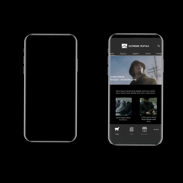
Extreme Textile – Fashion Discovery App
Role: UX / UI Designer
Sector: Fashion, Retail Technology
📍 Context
The fashion industry is fast-moving, but discovery of textiles and garments often relied on outdated, manual methods like boutique visits, catalogs, and word-of-mouth. Extreme Textile aimed to digitize this process, giving designers and buyers a modern tool to search, browse, and discover fashion textiles and pieces through a sleek and intuitive app.
❌ Problem
Fashion designers needed quicker, more accessible ways to find and compare fabrics and pieces. Existing solutions were fragmented, often offline, and lacked the ability to keep up with industry speed.
The challenge: how do we transform an analog discovery process into a digital-first experience that feels as inspiring as walking through a boutique?
🎭 My Role
As the UX / UI Designer, I was responsible for:
Designing the entire user experience from concept to high-fidelity prototype.
Establishing a modern, minimal UI system to reflect the premium aesthetic of the fashion industry.
Working with stakeholders to align the design with industry workflows and user expectations.
Exploring interaction design and visual storytelling to make browsing textiles feel engaging and elegant.
🔎 Process
Research & Discovery
Interviewed fashion designers and buyers to understand how they currently discover and evaluate fabrics.
Identified pain points: lack of centralized access, difficulty in comparing, and inefficiency of physical-only discovery.
User Journeys & Information Architecture
Designed journeys for browsing, filtering, and saving fabrics.
Prioritized simplicity — ensuring designers could find what they needed in a few intuitive steps.
Prototyping & Testing
Created interactive wireframes to validate search and navigation flows.
Conducted usability testing with a small group of designers; simplified search filters based on feedback.
Visual Language
Developed a clean, fashion-inspired interface with elegant typography, bold imagery, and whitespace.
Integrated subtle animations for transitions, reinforcing the feeling of a premium digital boutique.
💡 Solution
A centralized fashion discovery platform where users can browse, search, and save textiles and fashion pieces.
Sleek, modern UI designed to mirror the experience of a high-end fashion boutique, but fully digital.
Personalization features to recommend textiles based on prior searches and preferences.
📈 Impact
Early prototypes received strong positive feedback from designers, who appreciated the ease of discovery and modern look and feel.
Reduced reliance on physical boutiques, opening access to a wider network of fashion textiles and designers.
Set the foundation for expansion into features like supplier integration and AR fabric previews.

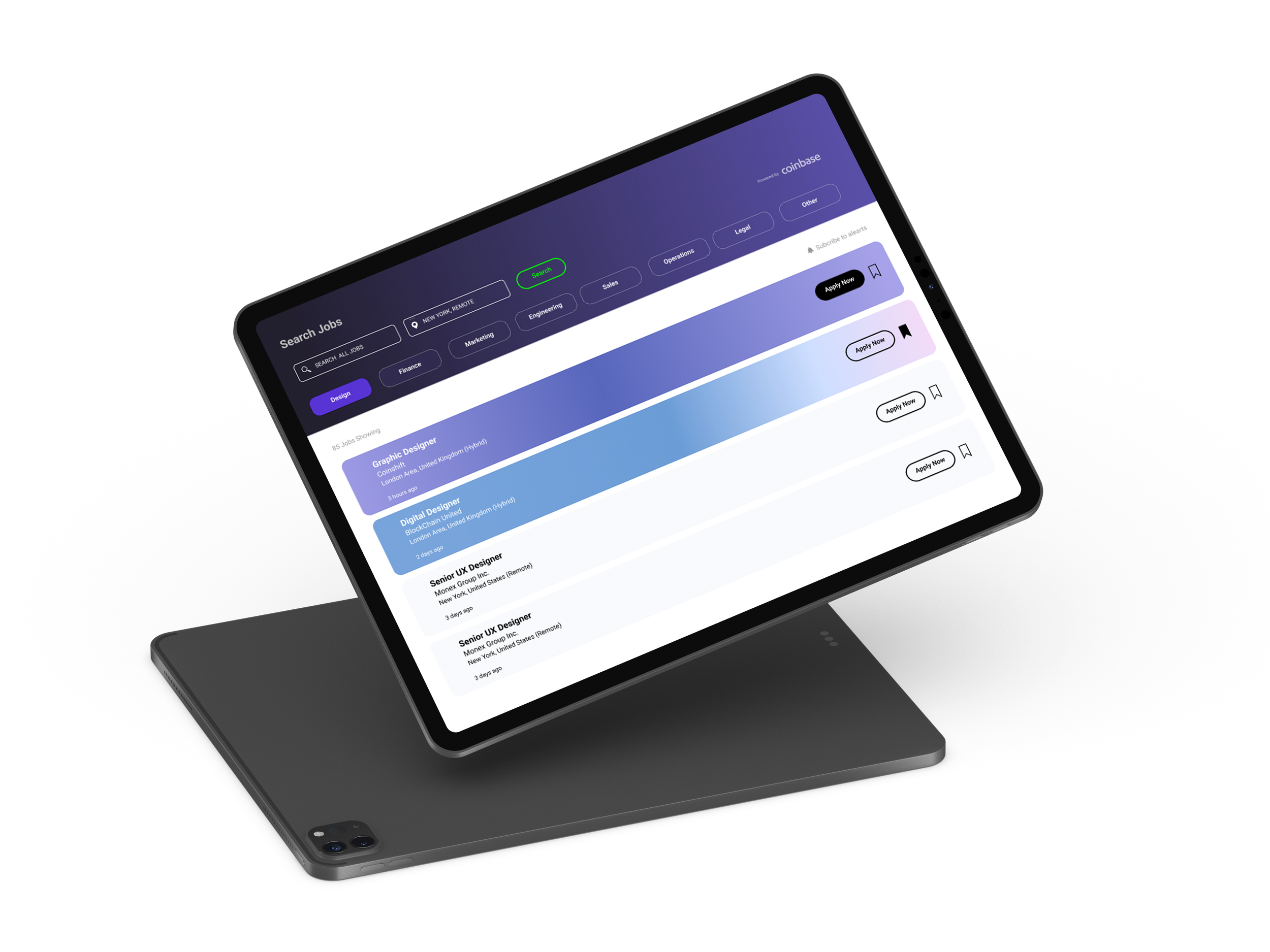
Crypto Design Jobs – Web Platform for Designers in Crypto
Role: Product Designer (Freelance)
Sector: Crypto, Fintech, Careers
📍 Context
During a freelance project in London, I was asked to design an online platform dedicated to connecting design talent with opportunities in the crypto industry. The idea was to create a space similar to LinkedIn, but focused exclusively on the fast-growing world of blockchain and Web3.
❌ Problem
Crypto companies often struggled to find designers who understood their space, while designers interested in Web3 found it hard to discover relevant roles.
The challenge: how do we create a platform that feels as professional and trustworthy as LinkedIn, but tailored to the unique culture and needs of the crypto community?
🎭 My Role
As the Product Designer, I:
Designed the end-to-end user experience — from profile creation and job listings to applications and community features.
Built a visual design system that combined professional polish with the energy of the crypto sector.
Created responsive UI for both desktop and mobile, ensuring accessibility across devices.
Collaborated closely with the client to align on strategy, feature prioritization, and user needs.
🔎 Process
Discovery & Research
Analyzed existing job platforms (LinkedIn, Behance, AngelList) to identify gaps for crypto design roles.
Interviewed both crypto startups and freelance designers to capture requirements.
Information Architecture & Flows
Defined key journeys: posting a job, searching roles, applying, and networking.
Designed a streamlined onboarding process for both employers and designers.
Wireframing & Prototyping
Created low-fidelity wireframes, iterating with the client to balance scope and usability.
Built high-fidelity prototypes in Figma to simulate the full platform experience.
UI Design System
Developed a bold, modern interface — dark mode first with clean typography and bright accent colors inspired by crypto exchanges.
Created reusable components (cards, buttons, filters) to ensure scalability.
💡 Solution
A dedicated career platform for crypto designers, offering job listings, profiles, and networking features.
Polished UI that blends professionalism with the dynamic visual language of Web3.
Mobile-responsive design for accessibility and ease of use.
📈 Impact
Delivered a fully designed, investor-ready platform prototype within 6 weeks.
Helped the client secure early interest from startups in London’s crypto community.
Provided a scalable design system that could expand into future features (messaging, portfolios, crypto-native payment options).